UI/UX Designer | Visual Designer, available for work.

Conversion Screens

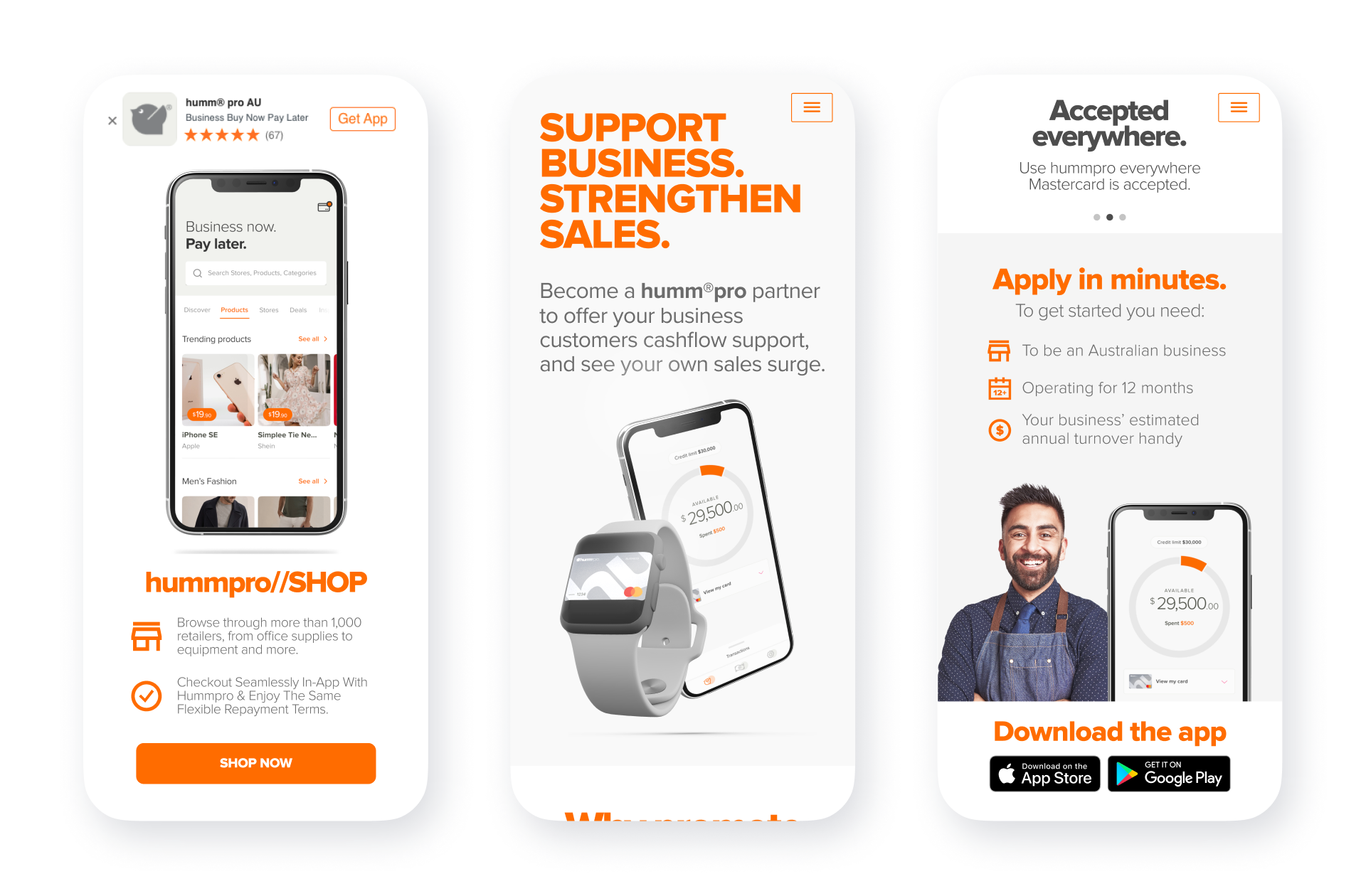
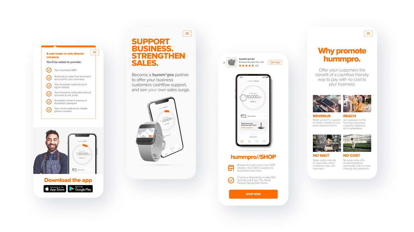
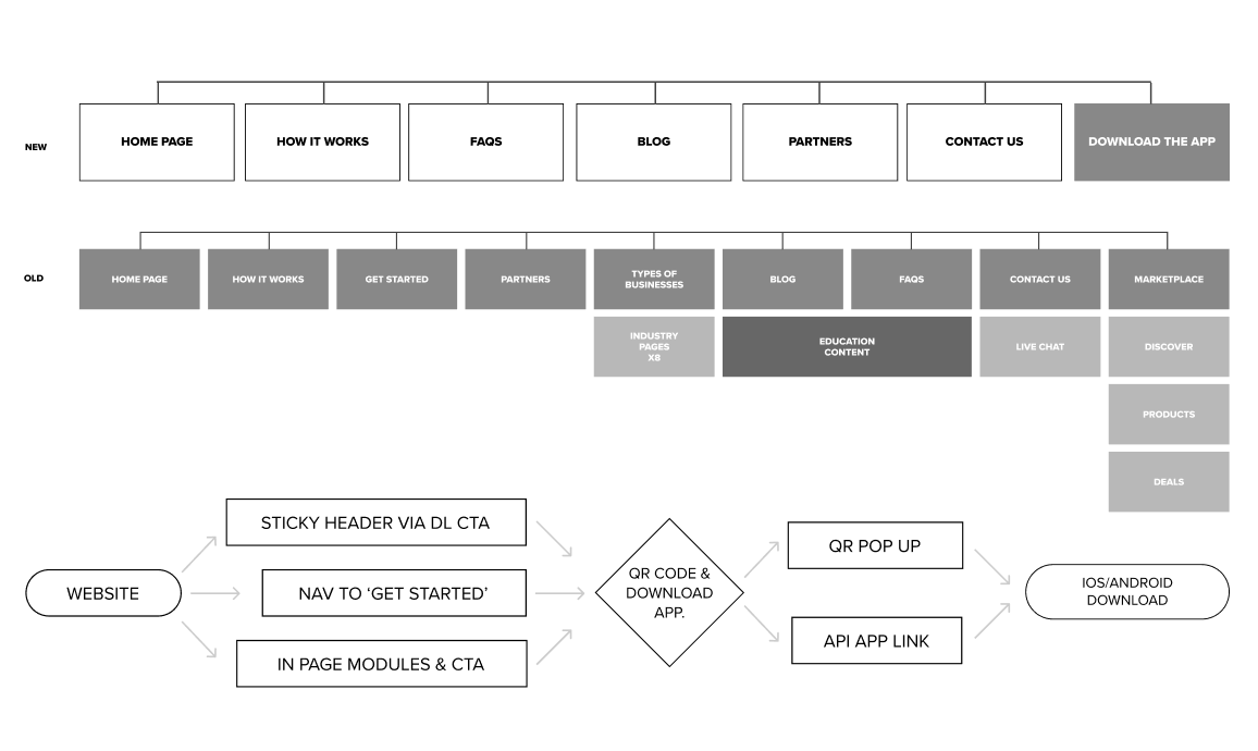
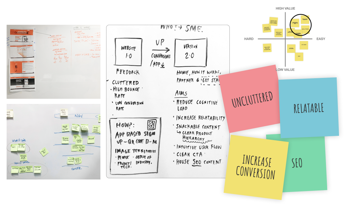
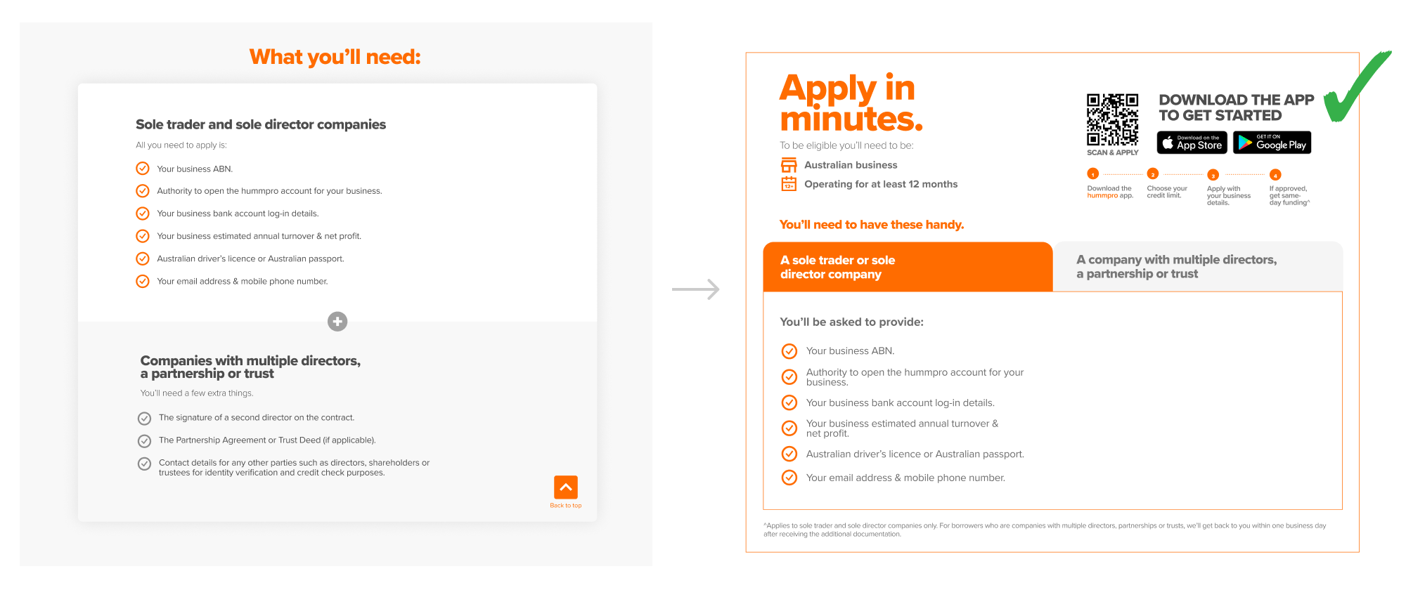
Noticing a drop-off in the application process, we simplified the information required and added QR codes, app store buttons, and strong calls to action. We also introduced a step-by-step approach to set expectations and emphasise core product value propositions. We integrated Branch.io up front on mobile-first and prioritised essential information for conversion.

Information architecture and conversion flows

We overhauled the top-level navigation and nested content within pages to make it easier for users to discover the content without searching through massive dropdown menus.

After discovering a disconnect in the conversion funnel for customers to download the app, we realised that the website was not working hard enough. I introduced QR codes and created sticky headers with an always-on call-to-action to address this issue. As a result, we saw a significant increase in conversions, with a 75% improvement.
Initial brainstorm and level checking
This informed the brief and allowed pain points to surface.
Empathy Mapping and Persona creation
We develop customer personas based on insights provided by our external agency, Roam, to understand who our customers are and their needs. This information helps us make informed design decisions.
A/B Testing & Data driven decisions
We tested different imagery territories and user engagement using Hotjar. We found a combination of human and tech-based images proved to be effective. Additionally, we reduced vertical scrolling and organised information into tabs based on user tracking.
Thanks for stopping by, let's get in contact.
linkedin facebook pinterest youtube rss twitter instagram facebook-blank rss-blank linkedin-blank pinterest youtube twitter instagram