UI/UX Designer | Visual Designer, available for work.

Website redesign

Client: hummpro
Industry: Fintech
My role: Lead UI/UX designer
The Team: Creative Director, Project Manager, Copywriter, Digital producer and Front-End Developers
Project: hummpro’s website was essential for communicating the product's value proposition, features, benefits, and application requirements for the customer. To improve the old website's performance and conversion rates, The team identified pain points, tested the UI and conversion triggers. We then modernised and refreshed the website, guided by a UX framework, which led to a successful and budget-friendly delivery.
Mobile & Tablet view of hummpro website

Wireframes & UI Design System

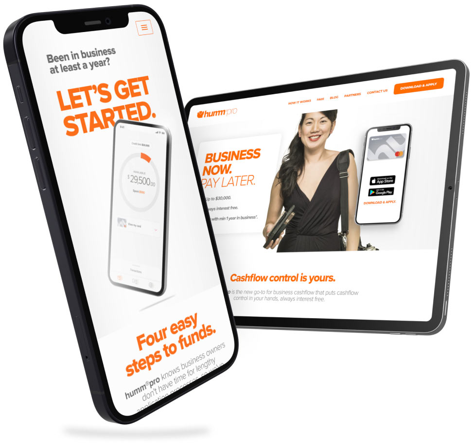
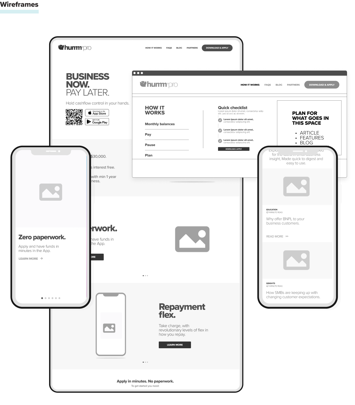
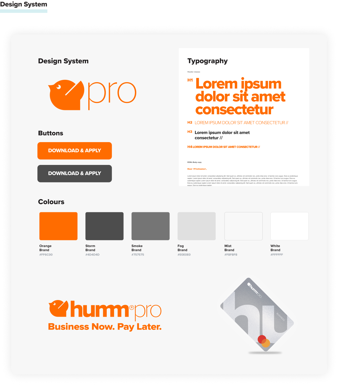
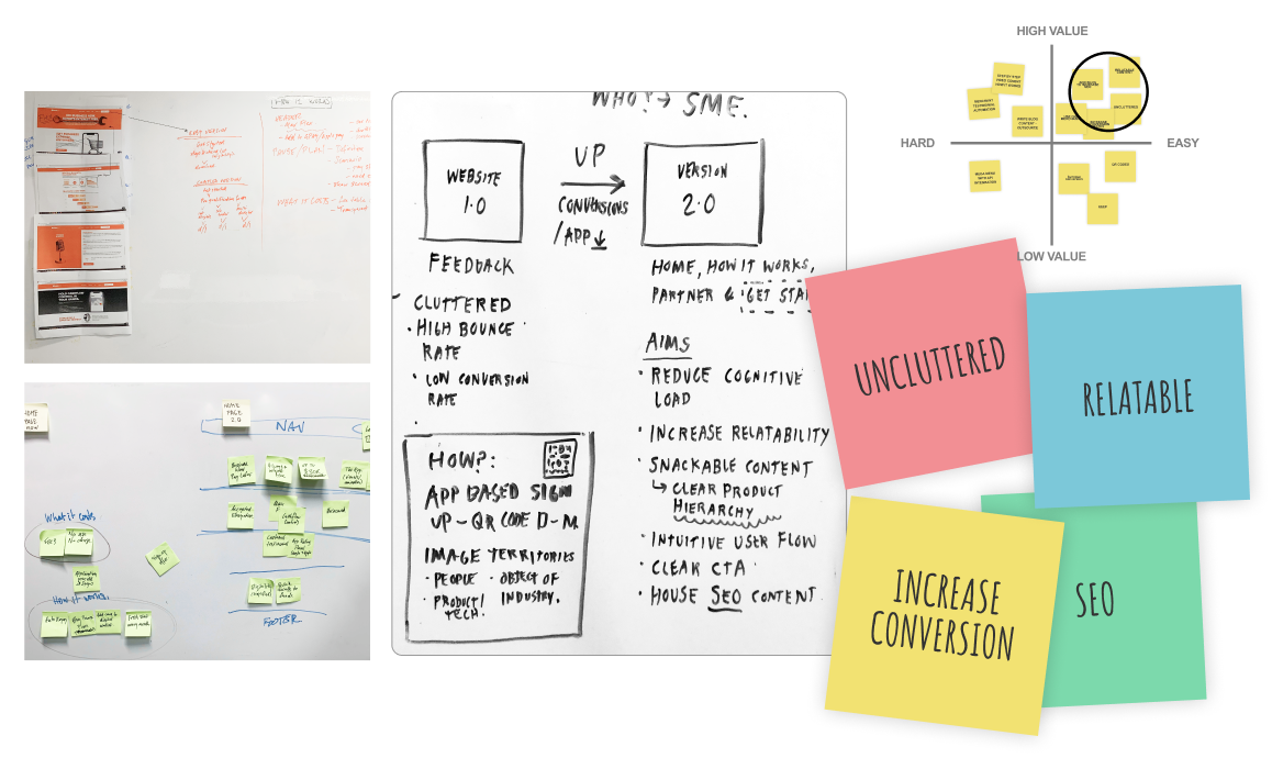
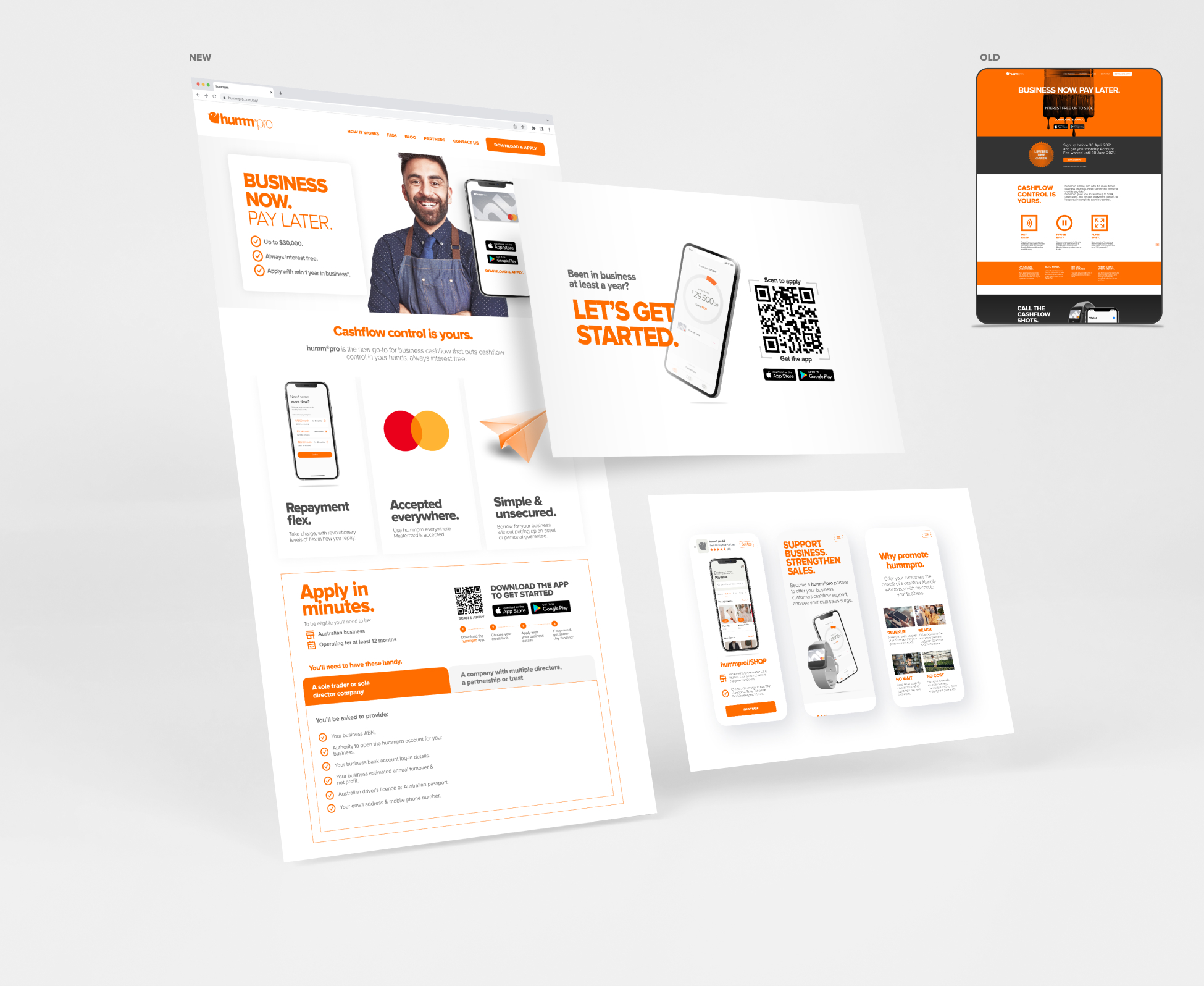
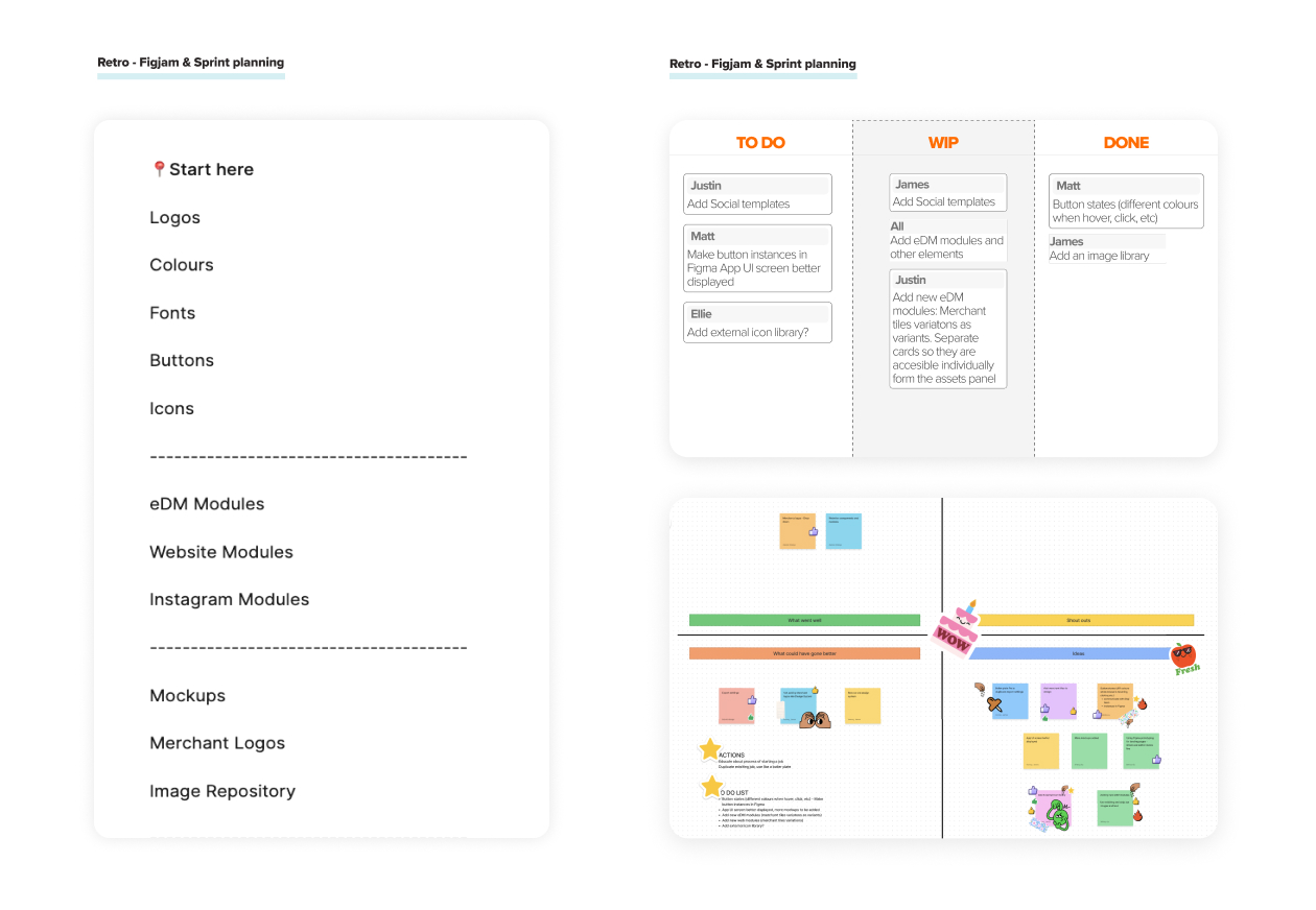
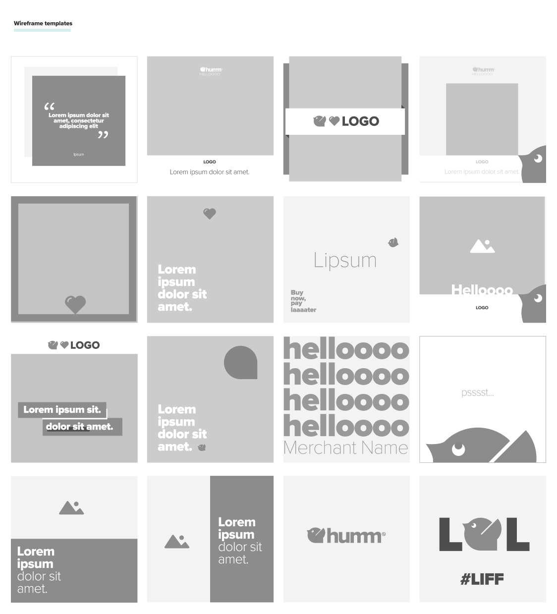
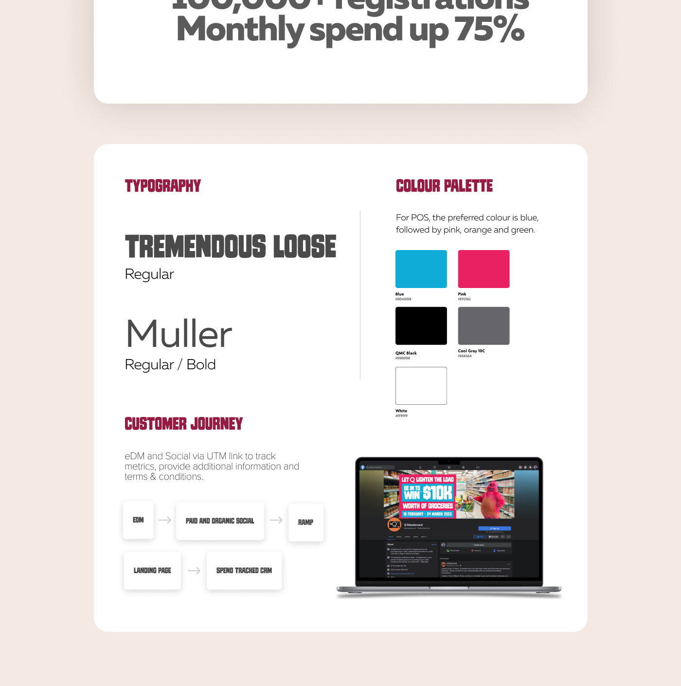
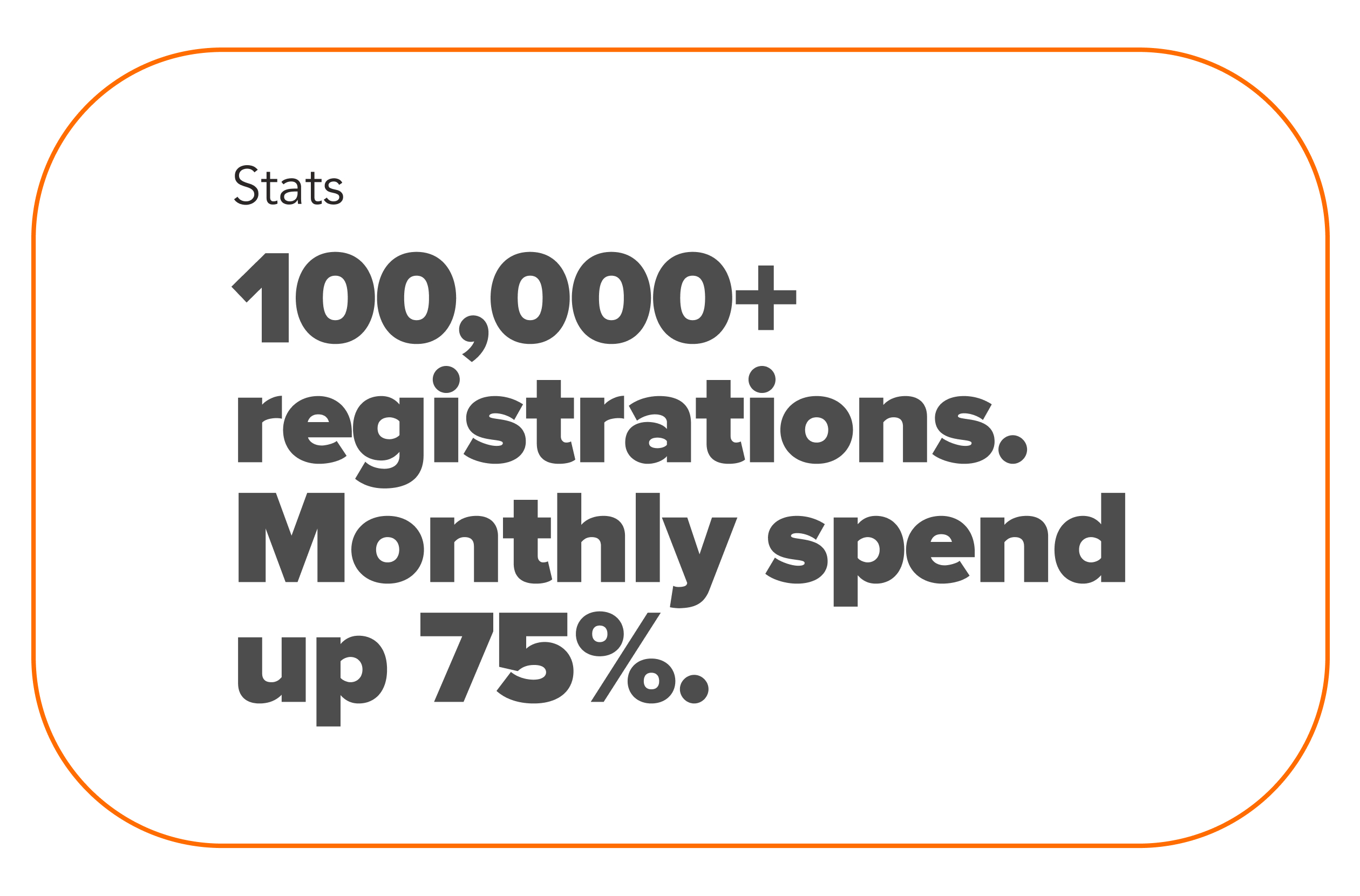
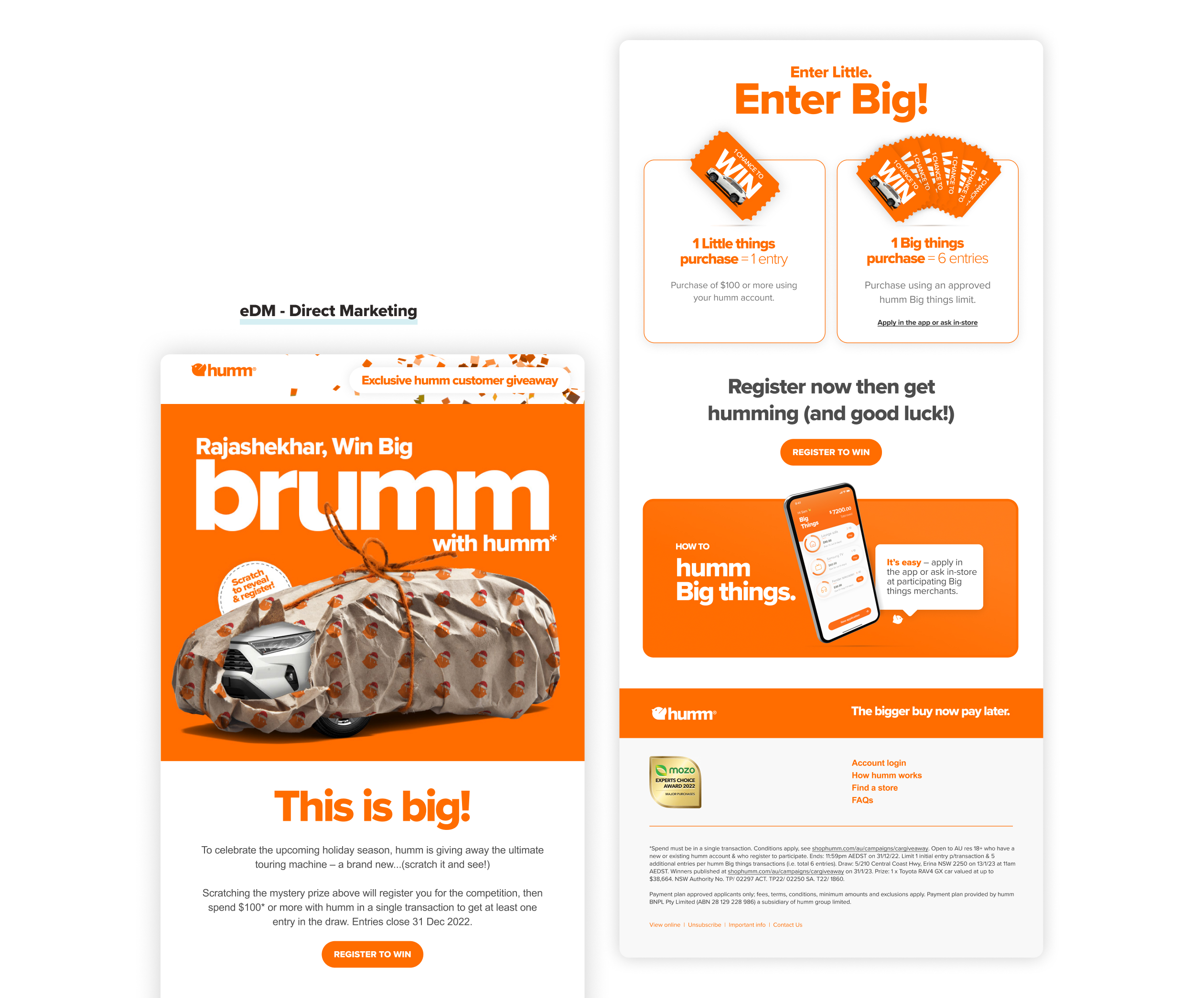
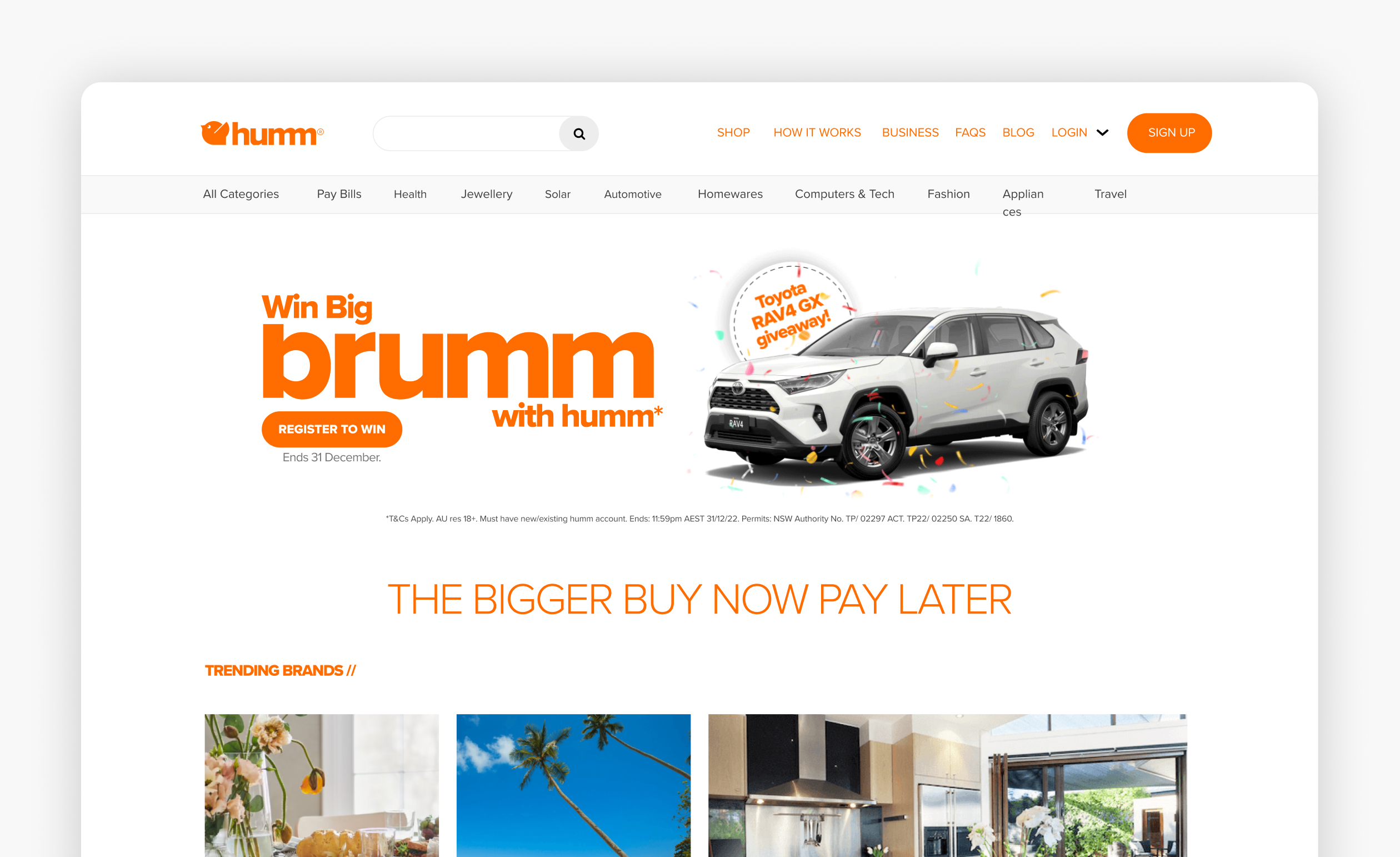
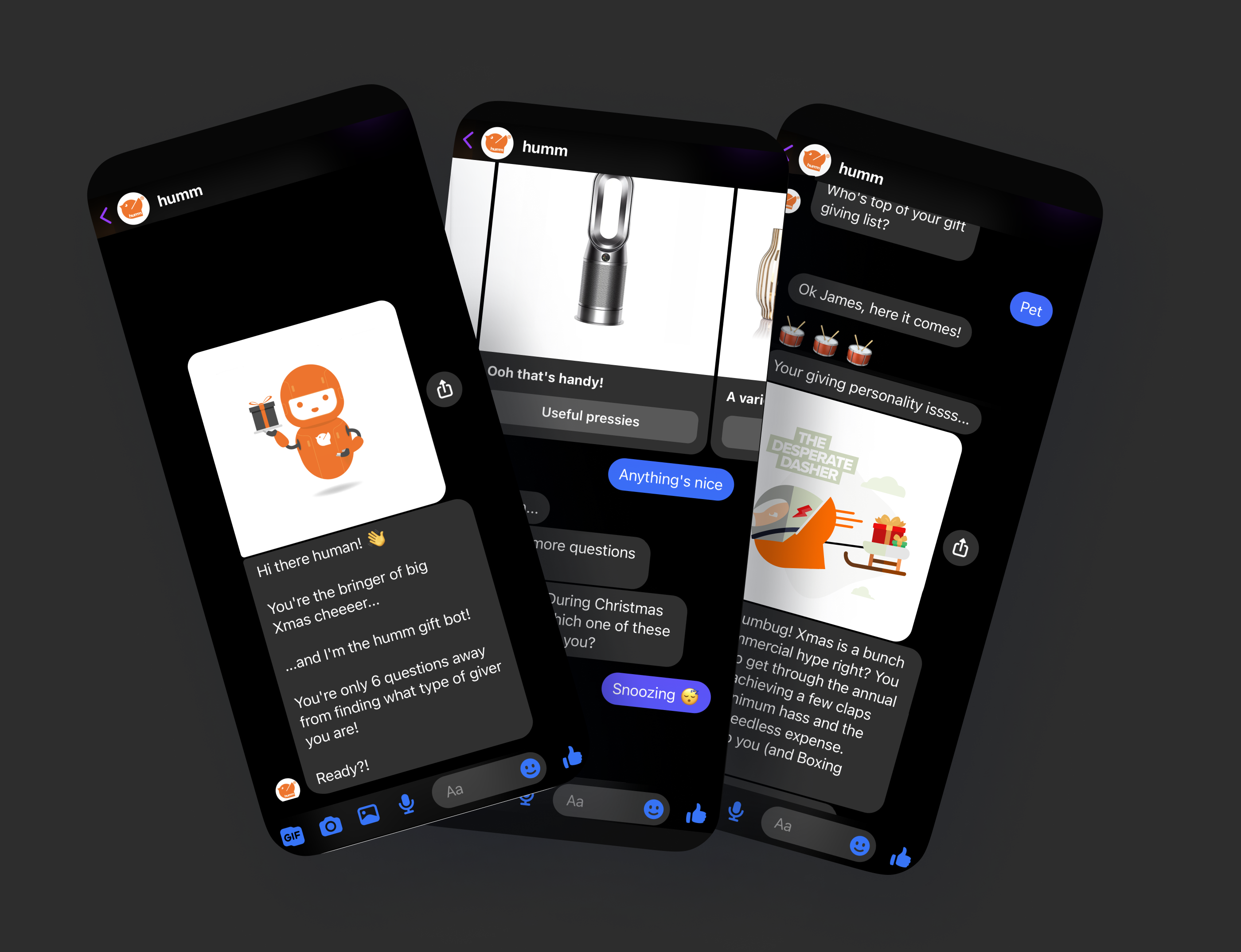
At this stage of the project, wireframes played a crucial role in organising UX copy and mapping out conversion flows, while also allowing for sign-offs. To make changes seamlessly, I integrated the UI into a basic design system. As the design system was fleshed out, it aided in testing and speeding up the workflow, ensuring everyone was on the same page.

Information Architecture & Primary conversion flows

We overhauled the top-level navigation and nested content within pages to make it easier for users to discover the content without having to search through dropdown menus.

After discovering a disconnect in the conversion funnel for customers to download the app, we realized that the website was not working hard enough. To address this issue, I introduced QR codes and created sticky headers with an always-on call-to-action. As a result, we saw a significant increase in conversions, with a 75% improvement.
Initial brainstorm and level checking
This informed the brief and allowed pain points to surface.
Empathy Mapping and Persona creation
We develop customer personas based on insights provided by our external agency, Roam, to understand who our customers are and their needs. This information helps us make informed design decisions
A/B Testing & Data driven decisions
We tested different imagery territories and user engagement using Hotjar. We found a combination of human and tech-based images proved to be effective. Additionally, we reduced vertical scrolling and organized information into tabs based on user tracking.

Conversion Screens

Noticing a drop-off in the application process, we simplified the information required and added QR codes, app store buttons, and strong calls-to-action. We also introduced a step-by-step process to set expectations and emphasised core product value propositions. We integrated Branch up front on mobile-first and prioritised essential information for conversion.

Design refresh

We improved the design by introducing white space, flipped the colour scheme, and used images that depicted relatable small business owners. Above the fold, we highlighted three key benefits, used cards to emphasise the product features, and created an information-rich conversion section.

“I put the customer at the center of everything I do. I love to create solutions that truly meet their needs.”

humm
design 
system

I developed Humm's design system and am actively running retrospectives to ensure that it continues to perform effectively for our designers.
Double-click this headline to edit the text.
This is a block of text. Double-click this text to edit it.

“Attention to detail is crucial - every pixel and interaction matters when creating seamless experiences.”

Social Media templates

I developed these templates and included them in our marketing design system. Our team needed usable, 1-1 social media post templates for our organic feed that I could adapt for various merchants, offers, and special promos.

App Store optimisation

To increase app downloads, I designed an app store listing with a catchy intro screenshot showcasing core app features and value propositions. I utilised product mockups to highlight functionality and included a clear call-to-action in the final screenshot to prompt users to download my app. Combining screenshots with phone mockups or graphics created an engaging experience that encouraged users to explore more.

Marketing Campaign

I executed a marketing campaign for the New Zealand brand Q Mastercard that involved direct email and paid social media advertising. The campaign successfully drove traffic to landing pages.

Monthly giveaways to drive spend.

Customers who make purchased with their Q Mastercard automatically have a chance to win.

Car Giveaway

The campaign was designed and rolled out across direct marketing and organic social, which drove traffic to landing pages where user registrations were captured. Digital campaign: A take over of shophumm.com which drove to the landing page. Movable Ink's martech facilitated the implementation of a scratch-off mechanism, which significantly increased user engagement and click-through rates.
Thanks for stopping by, let's get in contact.
linkedin facebook pinterest youtube rss twitter instagram facebook-blank rss-blank linkedin-blank pinterest youtube twitter instagram