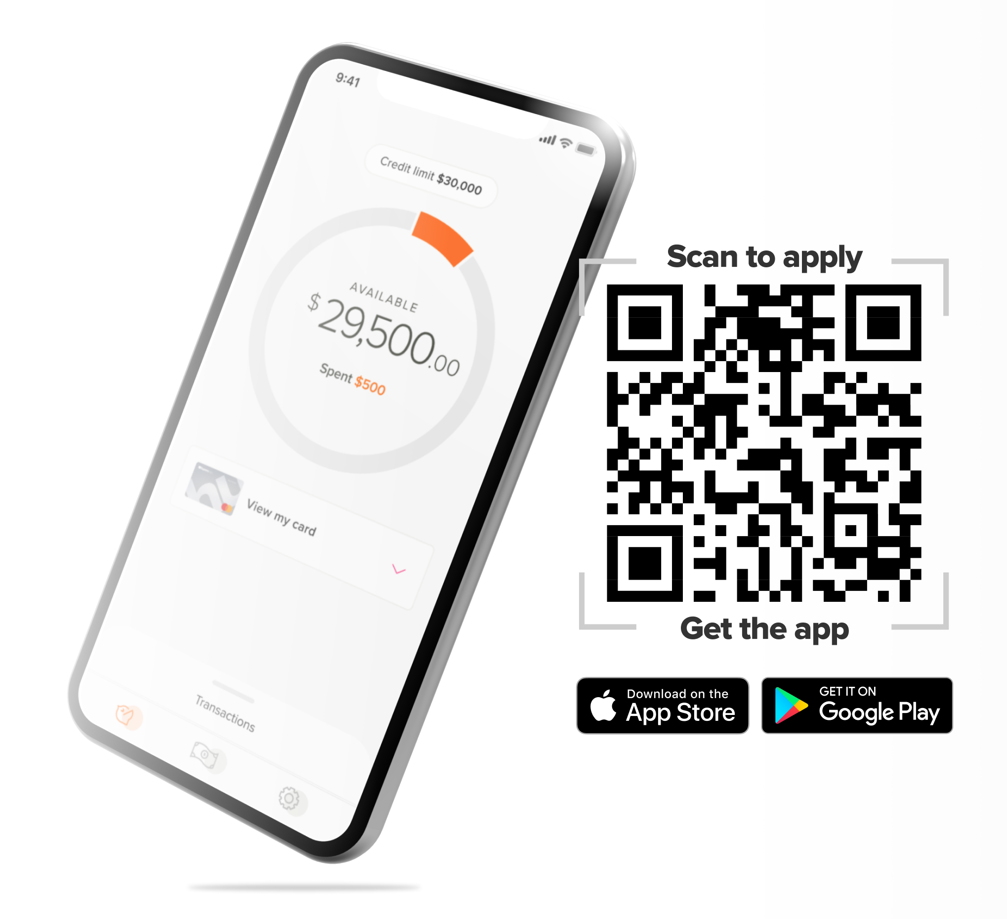
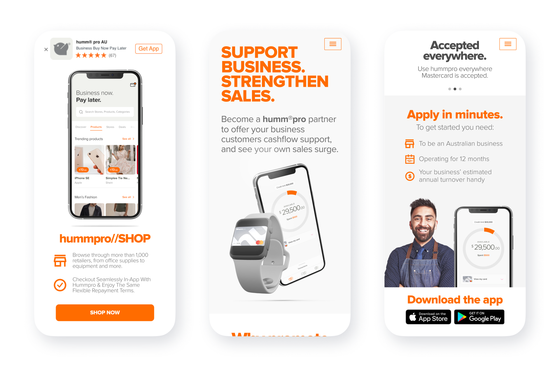
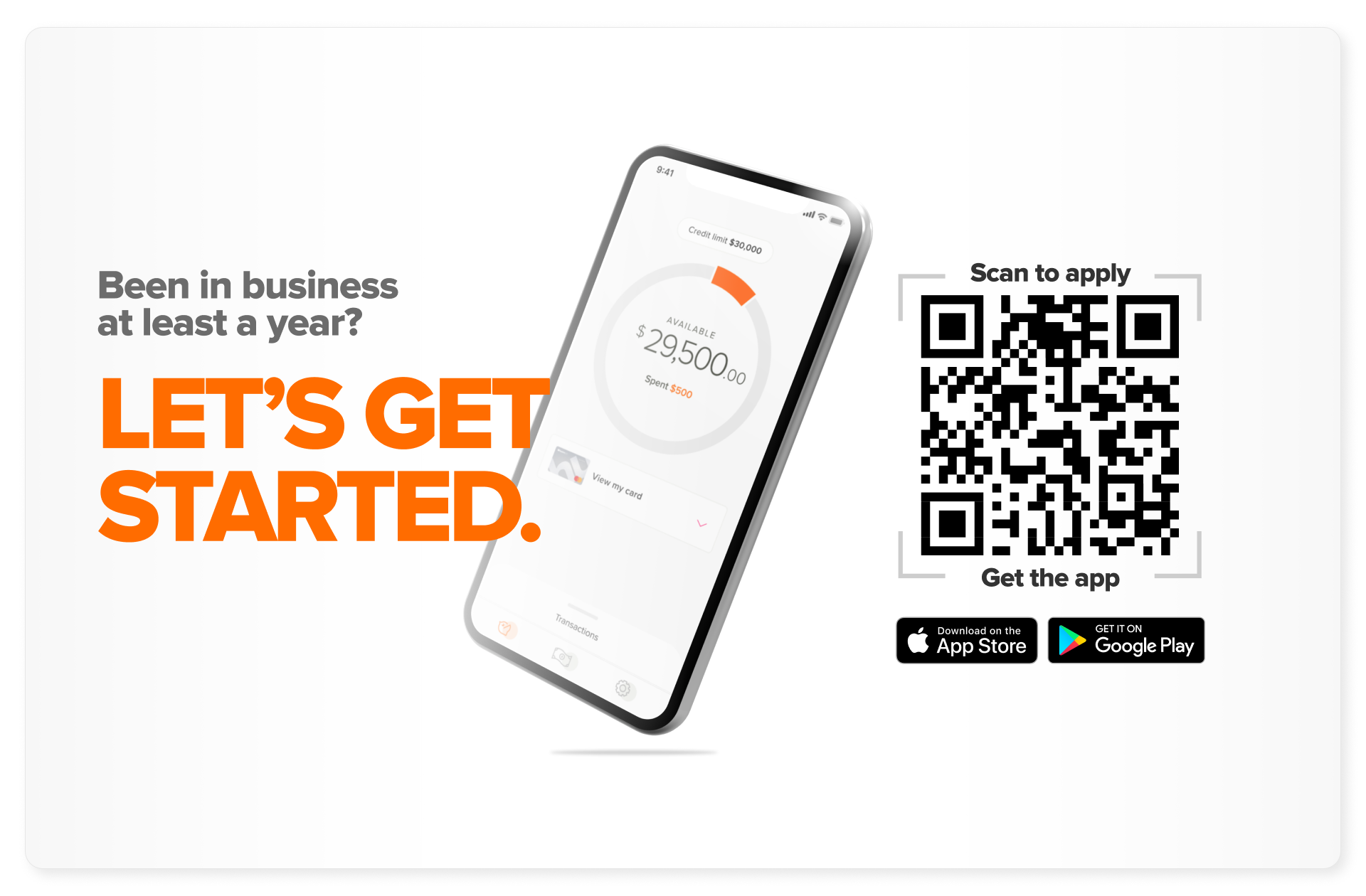
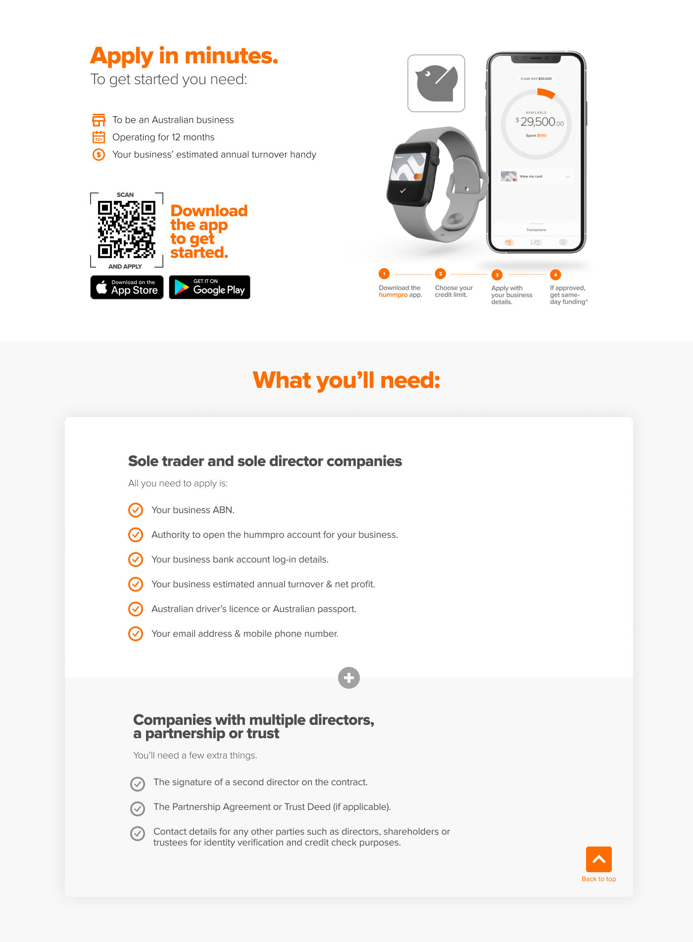
I integrated Branch.io up front on mobile with a clear CTA of 'Get App". Above the fold I prioritised essential value proposition information that tested well. I mixed tech and people-based images and reduced the cognitive load in the how-to-apply sections.


